Well, folks, I’ve been poking around at this cover long enough that I really can’t tell which one is the best. I’ve already put the book up for pre-order on Amazon and other retailers (B&N, Kobo, iTunes, etc.) but I haven’t picked a cover yet. So I’m putting several possibilities up for your feedback here!
Poll is at the bottom now closed, but qualitative feedback is helpful, too!
(and if you’re interested in being involved in the reveal of the final cover, an excerpts and release blitz, or reviewing the book on Amazon or Goodreads, please fill out: this signup form).
Images under the cut:
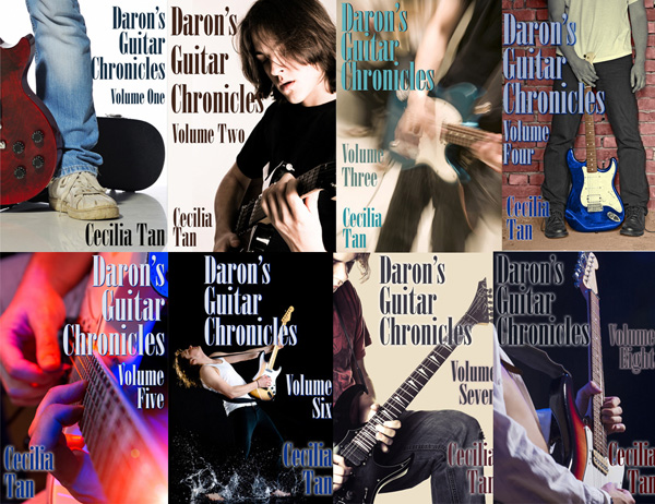
First, here’s a reminder what the previous 8 volumes of book covers look like:
All images below come from Dreamstime.com and because these are comp versions they have the swirly Dreamstime watermark and crosshatching on them. Ignore that part, OK?
IMAGE A “Guy in Red Flannel”
With three text treatments, 1, 2, and 3:
A1:
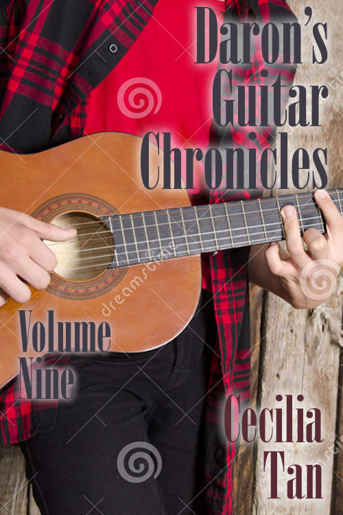
A2:
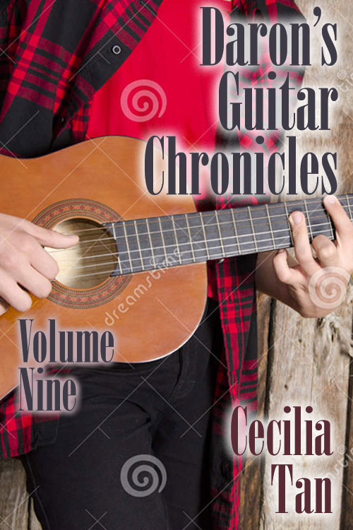
A3:
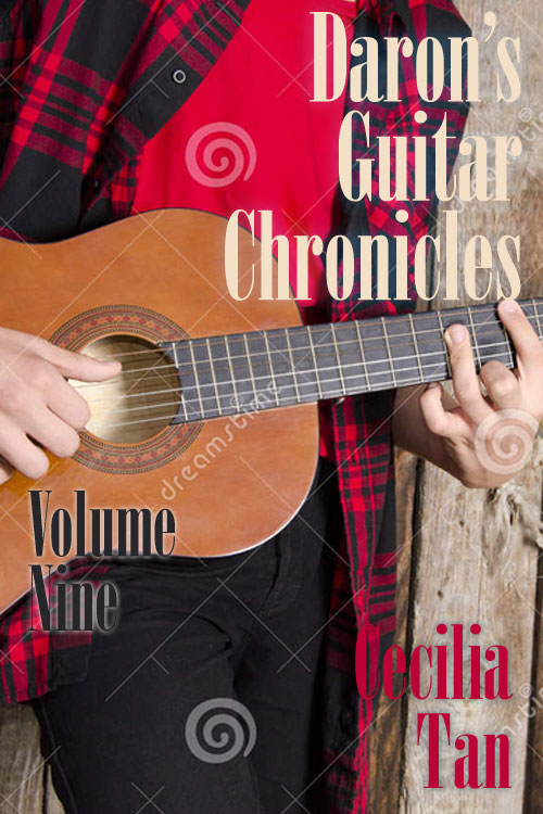
Things that Image A: Guy in Red Flannel has to recommend it. Daron’s red flannel shirt is canonical, mentioned more than once, and red’s his favorite color. Or, as he explains it, the only bright color he feels men are allowed to wear without getting their masculinity into some kind of image jeopardy. Also, I’m a big fan of hands, and these are sufficiently Daron-like for me.
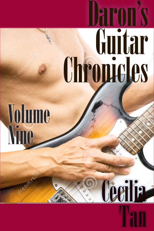
IMAGE B “Man Nipple”
With two text treatments, 1 & 2:
B1:
B2:
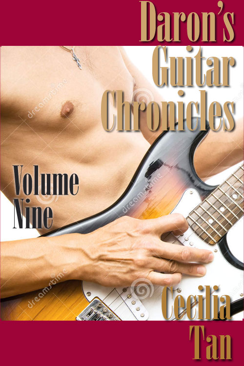
Image B: I believe the man nipple speaks for itself as to its merits. (The drawback is this is not erotica and I don’t want people to be misled into thinking it is.) Nice hands here, too.
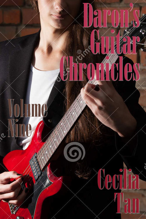
IMAGE C “Long Haired Dude”
With two text treatments, 1 & 2:
C1:
C2:
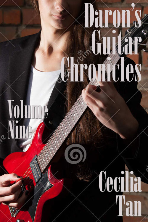
Image C has the advantage of demonstrating that Daron’s been letting his hair grow for like three years at this point and it’s about time one of these covers showed how long it’s gotten? Also nice hands and a nice bit of face, what we can see of it. The guitar isn’t in the canon but it is red, which as mentioned is Daron’s color.
[poll id=”3″]
[poll id=”4″]

If the black nail polish is canon for Daron, I like 3B best because the body shape is how I picture him, though the mouth seems a little too prim. It has the most readable font. My second choice is 1B because the font is clear but its still snazzy. Man nipples seems too cut for how scrawny Daron says he is. (But you would know best) Also the bare chest might provoke a snap judgement that it’s shallow ‘romance’ pap, which it isn’t.
Playing with the font style/color/shadows is the last step after figuring out the rest, so don’t concentrate too too hard on that, Barb. I’m sure at some point Daron’s done black nail polish. He hasn’t been scrawny since 1989 though. 🙂 But I’m generally thinking the man nipple just doesn’t fit the tone of DGC that well….
I like A2 because it is Daron’s customary red shirt and I like the white behind the lettering. Makes it easier to read. I would not be opposed to B1 if ‘Cecilia’ moved just a bit to the left so the ‘a’ didn’t blend in with the black on the guitar. Daron shirtless…oh yeah. C does not look like Daron to me. The guy is standing up too straight, too formal, and I don’t like his hair pulled to the side like that, especially not the side where the guitar strap crosses his shoulder. Daron’s complained about getting his hair stuck in the strap before. That one just doesn’t look like Daron The Rock Star, more like Daron the music school student who would get wacked on the head for slouching. Lol
I like A2 best. I like the photo and I think the font is easy to read with the white behind it. The nipple photo and the one with the hair just don’t make me think of Daron. I think the red shirt is most like Daron.
It looks like the red shirt is carrying the day. (I think Man Nipple could fit, though, as often as he’s talked about getting out of bed to play/compose becasue something has occurred to him. Although … it would probably need to be Guy With Guitar In Bedroom to really fit.)
That said, can you do a cleaner but still bright (… and maybe different color) drop-shadow behind the letters for A2? You need something there, because the combination of red-on-red-cloth AND one of those being plaid makes it too busy for the letters not to need some help standing out. The text treatment in A3 just doesn’t work at all, but A2 is a bit too blurry. You’ve also got the issue of moving from dark (cloth) to light (the wall) and needing to bridge that in a way that doesn’t make the text get lost.
Yes, getting out of bed to play.
Maybe for a future book… with a slightly different cover treatment…
C2!
I voted for A1. I personally like the flannel guy best and I think it best fits the theme of the previous covers (all the guys are clothed). However, bare man chests sell books, so you might consider nipple guy. I don’t like the cover with long-haired guy at all.
Typography wise, I don’t have a preference between A1 or A2, but I don’t like A3. Three different styles is too much.
The one thing that looks a little odd to me is it looks like a brand new, from the store flannel shirt, but I’m thinking I can adjust the colors a little and maybe add some grunge…
A1 or A2